3.0.1

General comments and questions. Technical support.
Post Reply
User avatar
admin
Site Admin
Posts: 2824
Joined: Wed Jun 05, 2002 10:48 pm
Contact:

3.0.1

Post by admin »

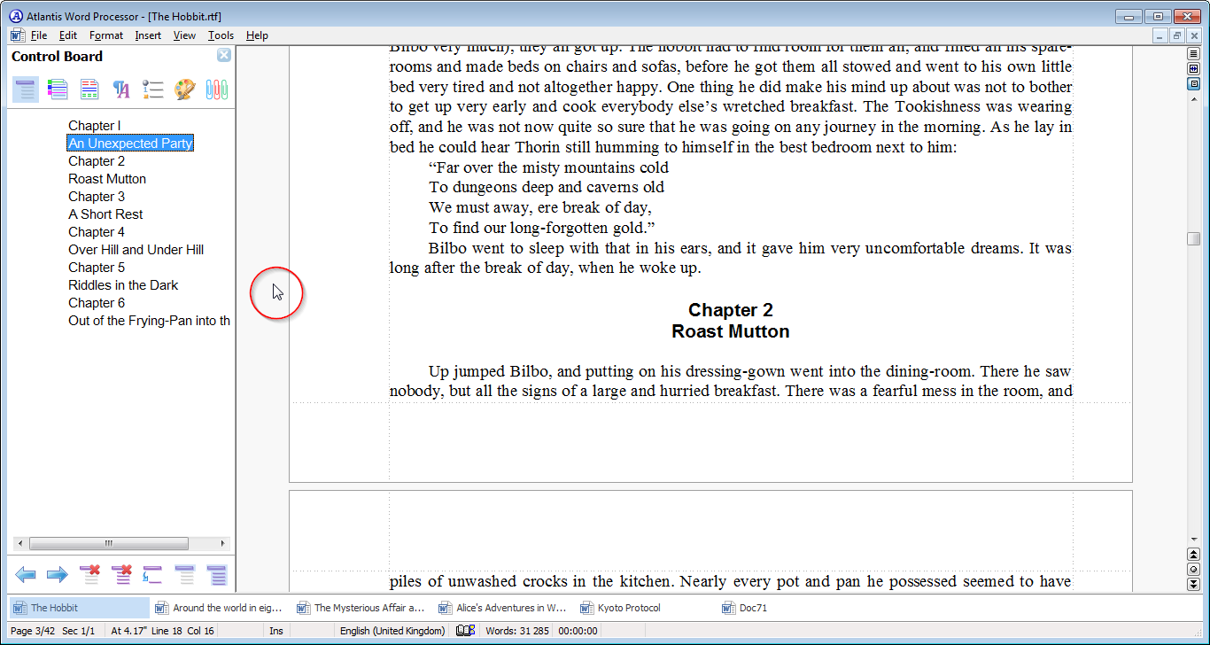
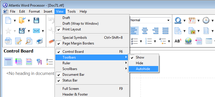
Version 3.0.1 of Atlantis Word Processor will have a new "autohide" option for toolbars:

Image

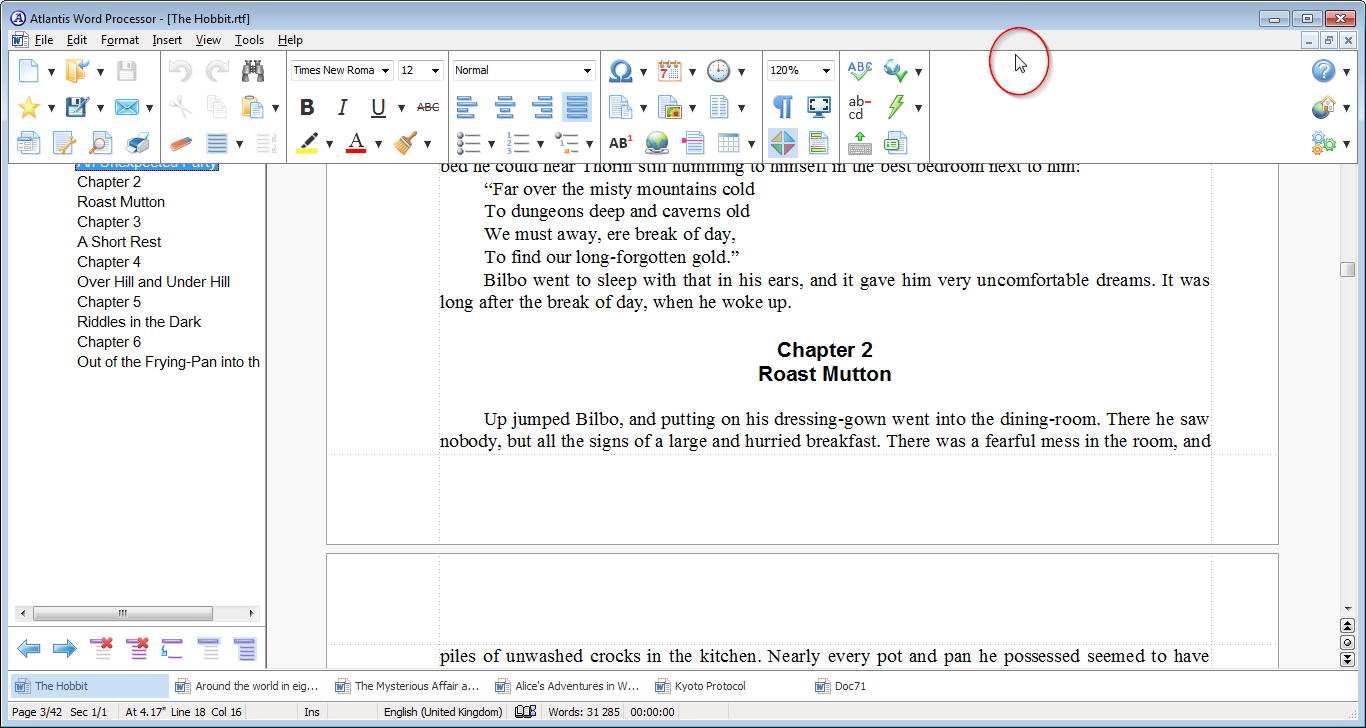
When this option is enabled, the toolbars display over the other UI elements and the document contents only when you hover the mouse over the area close to the main menu and the title bar of the Atlantis window:

Image

Image

The "autohide" option provides more space for document contents compared to the permanently enabled toolbars.

The "autohide toolbars" will automatically be available under the Full Screen mode.
wcpeace
Posts: 38
Joined: Sun Jan 18, 2015 4:01 pm

Post by wcpeace »

good idea. I like it. I'd be willing to try this out!
patr
Posts: 82
Joined: Fri May 06, 2016 8:05 pm

Post by patr »

You're missing the point about the toolbar hide. We'd want to hide it because it's terrible. That is first.

Second, autothide means yet another fold out delay upon reappearance of the toolbar.

What people like about the old interface (although it was Win95 look, let's be honest) is that the functions are RIGHT THERE and immediately accessible without foldouts and menushowdelays (that's the way it's spelled in the Windows registry so I use that term).

It's amazing how developers always muck up their programs. Atlantis is popular because most productive people hate MS Office ribbon bars and the ones who have to use it will largely use the classic toolbar plugins. No one was asking for Atlantis to have a weird menu, they just wanted the toolbars and icons not to look like Windows 95. The new menu does not add any function, efficiency, or speed. In fact, it's the opposite.

It's like Microsoft's start menu design: people who need to be productive will install Classic Shell while MS developers have their fun imposing bad designs on people.

I'm telling you now, it will backfire on you if you maintain this course. And I honestly don't understand what you think is better (in any way) about this new GUI. It has no merit whatsoever. What is easier to access? Nothing. What about the new GUI makes things faster? Nothing. The only thing better is the icons and they are too large and not customizable. Even if they were, there is still no merit in the GUI.

I tried to be nice about it but I see I have to be matter of fact because you only answer people's concerns selectively which is a bad way to go about customer concerns.

You can realize it now or later, but the only thing people want is simple, directly accessible icons on menu bars (horizontal) with new icons, and a default and dark theme so Atlantis and Windows 10 menus won't burn their retinas when they work at night.

Look, I wish nothing but the best for Atlantis and you and any developer involved. And there is no shame in changing course. But I really think you have to change course on this new GUI. I'm really trying to find any improvement in efficiency, function, or speed in it. And I just can't find it. Can you?
wcpeace
Posts: 38
Joined: Sun Jan 18, 2015 4:01 pm

Post by wcpeace »

I was drawn to Atlantis many years ago because it is much simpler plus, at the time I liked the ability to make it sound like a typewriter! I prefer silence now though.

Our world continually gets more complex (Thought positively of as "progress" by some), and some people seek out simpler alternatives, others just live with the complexity, but end up becoming blind to other things due to time needed to deal with the increasing complexity (a.k.a specialization sometimes).

With that said...

Visually 3.x is a jarring change. More "in your face / busy looking" As noted, I'm willing to give autohide a try, not entirely sure how it will impact the way I do things. But I it would probably be good to have it as a stopgap measure until the new toolbars can be improved via customization and sizing.

There's a reason I don't use Word 20xx.

Attached is an image of 3.x with all the dead space on the right hand side.
Now Atlantis 2.x has this too...but because of the thinness of the bars, I hasn't bothered me. Plus, I could hide any of the 3 bars.

well..best of luck...
Attachments
atlantis 3-0 on 4k UHD.jpg
atlantis 3-0 on 4k UHD.jpg (55.94 KiB) Viewed 11031 times
patr
Posts: 82
Joined: Fri May 06, 2016 8:05 pm

Post by patr »

BTW, you can already hide the new UI, it's just not auto-hide yet. But as I noted, auto-hide would bring its own problems, namely fold in/out delays which are counterproductive. (We can also hide current v2.x toolbars, just like we can for the new UI in v3.) So in short you can try the hidden menu out already on v3.0.

So: the absence of the new UI is not what goes toward the merit of the new UI.
User avatar
admin
Site Admin
Posts: 2824
Joined: Wed Jun 05, 2002 10:48 pm
Contact:

Post by admin »

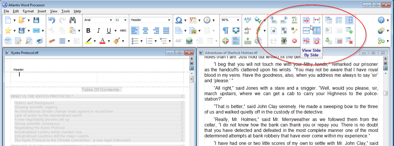
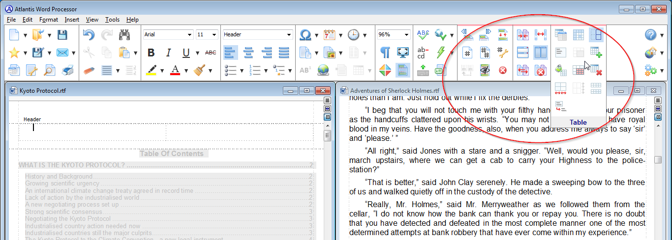
wcpeace wrote:Attached is an image of 3.x with all the dead space on the right hand side.
The dead space is meant mainly for context toolbars. Version 3.0 has about 15 context toolbars offered in certain cases:

Image

Image

Image

Image

Image

Image

Image

Etc.

We also have more ideas on utilizing that dead space in future releases. For instance, offering a new "position" for the document bar - "within toolbars". Or embedding the Find/Replace function into the toolbars.
User avatar
admin
Site Admin
Posts: 2824
Joined: Wed Jun 05, 2002 10:48 pm
Contact:

Post by admin »

wcpeace wrote:I'm willing to give autohide a try, not entirely sure how it will impact the way I do things. But I it would probably be good to have it as a stopgap measure until the new toolbars can be improved via customization and sizing.
The autohide option for new toolbars is not a stopgap measure, fix or workaround. It is a proper feature. There will be a number of ways to use it.
Last edited by admin on Fri Sep 01, 2017 2:38 pm, edited 1 time in total.
patr
Posts: 82
Joined: Fri May 06, 2016 8:05 pm

Post by patr »

If you're going to stick with this design, PLEASE make a dark theme as well (not just the already present color scheme options, but proper UI theme for the toolbars and other GUI elements).

EDIT: This is an example made in Photoshop; of course, the colors are filled in and the black text is not adjusted and it generally looks bad but it's just meant to give an impression. For dark themes, the menu text would have to be inverted to white (perhaps shaded) but alpha transparent icons should work fine on it (your existing ones should work).

Together with Atlantis' already existing coloring options it could make working with Atlantis a lot easier on the eyes, especially at night. Personally I already use f.lux on Windows even in the day time and I still find many interfaces (including Atlantis 3.0) too taxing on my eyes and I have 20/20 vision and no eye problems.

Image

EDIT2: If possible, could you also fix the issue on the page color (when set to anything different than white) where, if you include a PNG with transparency, it fill in the set page color around the image (blending) instead of just giving a big white space around the actual image. Meaning, it makes the transparent parts of a PNG white instead of transparent. So if you're using, say, a grey page color, and insert an image with transparency, it will create a big white area around the actual image because it makes the transparent part white. I guess it doesn't "aplha-blend" if that is the correct terminology.
User avatar
admin
Site Admin
Posts: 2824
Joined: Wed Jun 05, 2002 10:48 pm
Contact:

Post by admin »

Atlantis Word Processor does not support PNG transparency.
patr
Posts: 82
Joined: Fri May 06, 2016 8:05 pm

Post by patr »

Atlantis Word Processor does not support PNG transparency.
I know, that's why I requested it :)
Lito
Posts: 2
Joined: Thu Aug 24, 2017 7:57 pm

Post by Lito »

Just my 2c ;)

The big problem with these ribbon interfaces is they are designed for old 4:3 monitors. It seems outside of the graphics industry everyone is still not realizing almost all monitors are much wider than they are tall. So interfaces are just eating up the precious work space and slowing people down due to auto hiding things. That said IMHO outside the main menu bar, there should be really nothing else there and the tool bars should be on either the right or left side of the work space. It solves the issue of having the toolbars eat so much room since monitors are wider than tall, and it also solves the need to hide the tool bars and cause productivity slowdown while still maintaining the full page view of the work space. Not to mention you can have your larger icons and even put text below them if you wanted because you have the space.

For me autohiding is not really going to do much. I prefer to have everything within reach of the mouse without the delay of it unhiding, especially if I don't know the hotkeys for the particular function. That is what made v2.06 good for me, I customized the interface so everything that use to be in 3 stacked vertical toolbars were placed on just 2 stacked toolbars. My 2 toolbars in v2.06 are about the size of the first row of icons in v3. Even if allow me to customize it it doesn't look like it would be possible to duplicate all the features available to me in the same amount of space. So maybe the answer is to not follow the norm of a ribbon like interface and bring it to a more functionally appropriate design that was made for wide screen monitors. Please look at the photoshop interface for an example.
User avatar
admin
Site Admin
Posts: 2824
Joined: Wed Jun 05, 2002 10:48 pm
Contact:

Post by admin »

Version 3.0.1 has been released.

One tip on the keyboard shortcuts. In Atlantis, you can press Ctrl+Shift+F to open the "Font" toolbar box, Ctrl+Shift+P to open the "Font size" toolbar box, Ctrl+Shift+S to open the "Style" toolbar box, and Ctrl+K,Z to open the "Zoom" toolbar box. When the autohide option is on, and the toolbars are not displaying, these 4 hot keys can be still used to open the corresponding boxes, and display the toolbars temporarily.
lynneconnolly
Posts: 75
Joined: Tue Aug 08, 2017 7:44 am

New GUI

Post by lynneconnolly »

Thank you so much for the autohide. It makes the new iteration bearable.
Now I love this program. It does everything I want it to do, but I really can't get on with the new GUI and I don't have the time to learn it right now.
I downloaded and tried it, but within an hour I was back to my old version. I couldn't stand it. I'm sorry, I know you must have worked really hard on it, but it just doesn't work for me.

When Word went to the Ribbon, I got around it by creating my own toolbar, which in Word was the QAT (Quick Access Toolbar) and put all the commands I used a lot on to it. Then I barely troubled the Ribbon.
Then I created a Ribbon with the more detailed things I needed more occasionally. That meant I had all my commands in one place.
Really, for Atlantis to hit the big time with the new GUI, you need the following:
1. The ability to hide the Ribbon by default.
2. More ways of customising. Power users, who typically drill down deep in one specific area, find it far more useful to have their commands all together in the same place, rather than having to dot about from ribbon to ribbon. So a way of creating your own ribbon.
3. The choice of which ribbons to show and which to hide.
4. An alternative older menu-style interface. Every word processor I have tried that has ventured into the ribbon-style provides a way to keep the old menu-style. This will allow people to transition at their own pace, instead of at a pace dictated by the makers of the software. People hate having things imposed on them. Useful hints and tips via the newsletter, and actual demos of why the new interface is better than the old for specific tasks might help.
5. A Quick Access Toolbar where a user can put all the commands they use all the time. Immensely useful.
6. An HD ready interface, so the icons don't pixillate at high resolutions.
7. Track Changes, and a way of adding comments and notes to the text. If you had that, I wouldn't have to shift everything to LibreOffice half way through the process.

and a grammar check would be good, as well as a way of recording macros. But I haven't listed them because they're not as important to me.

Why did I stop using Word? I won't rent my software. That was number one for me. Two is the increasingly buggy and bloated nature of it. Three is the absence of tabs. You get all these things right.
Lynne Connolly
Post Reply