Thank you for the customization and autohide! It has turned something impossible into a usable interface.
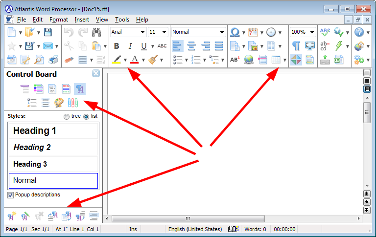
I've put all the icons I need every day on to toolbar 1, widened it to full width and reduced the number of display rows to one. That gives me a small, neat bar at the top. And with autohide, I can have it showing when I need it.
The improvements massively help. Thank you for listening. I've now upgraded full-time.
I give occasional classes on word processors for authors, and Atlantis is one of my recommended programs (the other is LibreOffice, because writers need Track Changes and Comments). I was advising classes to get the older versions with the old GUI, but these changes mean I can show them how to handle it.
New GUI
new GUI
Just wanted to add my voice to the chorus of those who would like an option to use the old toolbar interface. I don't see the new, ribbon-like interface as an advance. Avoiding the ribbon was one of the primary reasons I purchased Atlantis.
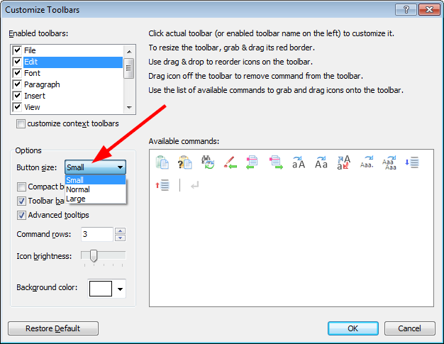
Did you have a look at Customizing toolbars and the associated video Replicating old toolbars in Atlantis Word Processor?
HTH
HTH
-
lynneconnolly
- Posts: 75
- Joined: Tue Aug 08, 2017 7:44 am
New interface
With the customisation features, it's much easier to get Atlantis looking the way you want it. You can add toolbars or personalised menus, and that's what I've done. I like it simple, so I have one toolbar showing and no drop-downs. The toolbar runs the length of the window, instead of being narrow.
Lynne Connolly
I know this topic is a bit dated by now but I just wanted to give a quick update regarding my use of the new UI:
I would never have thought that I would actually enjoy the new UI, but I actually do now. Thanks to the developers and volunteers here for bearing with me and people like me through the transition, because I know we voiced some strong opinions a while ago.
To surprise myself even more, I now prefer having the new toolbar on the side -- and crazier still: on the right side. I would never have thought I could even stand that notion, but I actually like it now.
I prefer to not have the toolbar menus fold out, so I set the boxes at a certain size and limit the function icons I display in it accordingly. Right now the toolbar is set to 6 icons wide and the sections vary from 1 to 4 rows high. I put my most used functions there in a way that is easy to find for me (sequence-wise) and it saves me so much time navigating.
I further love the -10 +10 zoom buttons that quickly and easily let me alter the zoom amount on any document opened. Very handy and quick.
Together with the already great feature-set of Atlantis it makes editing and writing a breeze.
Just thought I'd share some thoughts and experiences (albeit short). I thought I owed that having been one of the more vocal new UI opponents
Thanks again to Atlantis Word and its developers -- and for bearing with us. If it sometimes feels like a thankless job, please know that you guys are appreciated very much and that we love using Atlantis.
New GUI
VJF above says ..
Atlantis developers seem to have lost the plot.
More complex doesn't mean better. Recent versions of Atlantis have lost it's 'nice to use' feel.
Nothing of use to me in the new stuff. How about being able to type text over an image ? That would be nice.
Graham
Same here ..I'll stick to version 2.
Atlantis developers seem to have lost the plot.
More complex doesn't mean better. Recent versions of Atlantis have lost it's 'nice to use' feel.
Nothing of use to me in the new stuff. How about being able to type text over an image ? That would be nice.
Graham
-
lynneconnolly
- Posts: 75
- Joined: Tue Aug 08, 2017 7:44 am
New GUI
The tweaks that Atlantis has applied to its program has made the new GUI pleasantly usable for me. I created a bar, one icon deep, and put all the things I use regularly on to it. The rest is hidden. I don't have any other bars showing and I use the menu for anything else I need.
Before, when it couldn't be hidden, and it wasn't customisable, it was unusual for me. But the folks at Atlantis listened, and created the needed tweaks.
I recommend Atlantis now as a replacement for Word, in my classes for word processors for writers.
I used a different program by a German company but once a file got larger than around 50k words, or it had a number of revisions, it corrupted the file and the backups, just as Word is prone to do, so I had to switch. The techs seemed unable or unwilling to fix it.
The only thing Atlantis lacks as a complete replacement is Track Changes, but that's a big alteration and it needs to be introduced carefully. In the meantime, I use Libre Office for that (but LO doesn't have a tabbed interface!)
Lynne Connolly
-
freecicero
- Posts: 52
- Joined: Tue May 31, 2016 10:08 am
THANK YOU for the new option for smaller Icons! That helps a lot get back to the older look that I preferred!
Not that it matters much, but after customization my top horizontal toolbar is showing with two large directional arrows, one on left and one on right, which apparently indicate that I could scroll the toolbar in either direction.
is there a way to get rid of those, such as a "lock toolbar" function or otherwise?
The large directional arrows on either side of the toolbar area are shown only when there isn’t enough elbowroom to display all the toolbars (and/or the Document Bar if it’s embedded in the toolbar area).
If you could lock these directional arrows, you’d be unable to access the currently hidden toolbars. What’s more, there would be no space to display the context toolbars.
If you don’t want to have to scroll the toolbar area, you need to increase the number of toolbar rows or get rid of any unused toolbar buttons.
The following CTRL hotkeys are easy to memorize. Using them could help you get rid of unneeded toolbar buttons:

HTH.
Robert
If you could lock these directional arrows, you’d be unable to access the currently hidden toolbars. What’s more, there would be no space to display the context toolbars.
If you don’t want to have to scroll the toolbar area, you need to increase the number of toolbar rows or get rid of any unused toolbar buttons.
The following CTRL hotkeys are easy to memorize. Using them could help you get rid of unneeded toolbar buttons:

HTH.
Robert
-
freecicero
- Posts: 52
- Joined: Tue May 31, 2016 10:08 am

