Atlantis Word Processor 4.3.2 (beta)
Atlantis Word Processor 4.3.2 is available for betatesting.
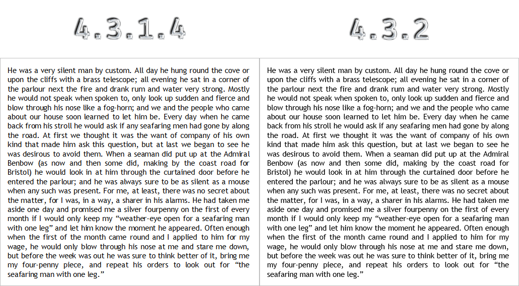
This version has a new text rendering engine. It provides more natural and consistent spacing between characters under different zooms, and improves text readability and overall look:
Please use the link below to download the setup file of the beta version of Atlantis, and use it to install the beta on your computer:
Setup file of Atlantis Word Processor 4.3.2.0 (size: 2.9 MB) (build b2, released on Jul 12, 2023)
You can install this new version to the current home folder of Atlantis on your system, if any, or to a different folder. If you decide to revert to the previous version, you can download & run its setup file to downgrade.
Use the "Help | Check for Updates..." menu command to keep your beta copy of Atlantis up-to-date.
Please post your comments, suggestions, or bug reports to this forum (click "Post reply" below). You can also email them to support@AtlantisWordProcessor.com. If you encounter any difficulty with this version of Atlantis, try to tell us as much and as accurately as possible about the problem.
Re: Atlantis Word Processor 4.3.2 (beta)
The rendering of the headline text is worse than it was before. The body text looks pretty good. But the characters in the heads are pushed together too close. I do not have a good example from a previous version of Atlantis, but I noticed the problem right away. So I compared the rendering of the current beta (4.3.2.0 beta a0) with the same text in LibreOffice. The headline font is Noto Sans Condensed. The body text is Noto Sans Serif. The computer that I used has Windows 7 for its OS.
I am sending a screenshot in an attached file. The top graphic is from Atlantis; the lower graphic of the same text is from LibreOffice. Sorry, but I have never understood how to post a graphic in the forum without first uploading it to a site somewhere and then using a URL link, and that is time-consuming and inconvenient. (Well, maybe attaching the file also posted it to my message; it appeared in the preview anyway.)
- Attachments
-
- TextRendering.png (71.24 KiB) Viewed 20138 times
Re: Atlantis Word Processor 4.3.2 (beta)
First, please update to the latest build (choose “Help | Check for Updates...”).
Are the headings in your document formatted with “Noto Sans Condensed” or “Noto Sans Condensed Light”? Are they also formatted with bold?
The only option to include a picture in your post without uploading it to another site first is to attach it to your forum post.
Are the headings in your document formatted with “Noto Sans Condensed” or “Noto Sans Condensed Light”? Are they also formatted with bold?
The only option to include a picture in your post without uploading it to another site first is to attach it to your forum post.
Re: Atlantis Word Processor 4.3.2 (beta)
My original post was based on the behavior of the most up-to-date beta available at the time.
I have now upgraded to 4.3.2.0 beta a1.
The rendering has improved greatly. Thank you!
The Noto Sans Condensed font that I used for the heads is bold in the definition of the style. One thing that may or may not be helpful for you to know is that I have a style called HEADS, which is defined as "Noto Sans Condensed, bold". Individual head styles are then defined as substyles of HEADS (the bold face is inherited but is not repeated in the definition).
Re: Atlantis Word Processor 4.3.2 (beta)
Actually the build a1 had a number of issues with the new text rendering mechanism.
Please update to the latest build. Then, could you please post a similar screen capture with text formatted with “Noto Sans”? Just to make sure that the text gets rendered with the grayscale antialiasing.
Re: Atlantis Word Processor 4.3.2 (beta)
I hope it's o.k. to join at this point too.
Sorry to say that for me rendering becomes significantly worse with the beta version.
Many characters are faded / blurry / unsharp now. (I don't know what's the correct expression).
Here just two examples.
"current" is with (the more or less recent) version 4.3.1.2
"planned" is with version 4.3.2.0 beta a4
The text is from rtf-files, not written directly in Atlantis but in MS Word (originally doc-files).
In the following images unfortunately the difference cannot be seen so clearly as it is in "reality". If you would need to see it better, I will have to create and upload a document for comparison.
Example 1:
a) current:
b) planned:
Please compare e.g.
- the letters "lfil" in the word "Spielfilm"
- the letters "it" in the word "mit"
- the "D" in the word "Doris"
- the quotation marks before the word "Pillow"
etc.
Example 2:
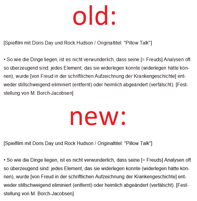
a) current:
b) planned:
Please compare e.g.
- the letter "n" in the word "Dinge" (in the first line)
- the letters "l" and "n" in the word "liegen" (first line)
- the letters "ei" in the word "seine" (first line)
- the "t" and the second "l" in the word "stillschweigend" (in the last line)
and many more
Re: Atlantis Word Processor 4.3.2 (beta)
Version 4.3.2 uses the DirectWrite mechanism (when available) to render document text onscreen. Previous versions of Atlantis use the GDI mechanism. Both techniques support text antialiasing. GDI uses the ClearType antialiasing. DirectWrite supports two antialising methods: ClearType and grayscale. Version 4.3.2 uses DirectWrite with grayscale antialiasing: if you zoom in screen captures of document text in old and new versions of Atlantis, the ClearType antialiasing is more colorful, while the grayscale antialiasing uses shades of the text color.
But the main difference between GDI and DirectWrite is that the latter supports subpixel positioning of characters. Even when the zooming factor in Atlantis is 100%, you actually see text zoomed down from a much more precise zooming factor (coordinate space). Under GDI, when zooming document text in or out, the intercharacter spacing is inconsistent most of the time because this spacing is a result of rounding precise values to pixels. DirectWrite allows to reposition characters within a paragraph line by a fraction of a pixel. This creates a much better intercharacter spacing, especially for normal (smaller) font sizes.
I do not agree that the new display is worse, even in your case with a bigger font size:
But future releases of Atlantis will allow to choose a text rendering mechanism (GDI or DirectWrite) and antialiasing mode (ClearType or grayscale).
Re: Atlantis Word Processor 4.3.2 (beta)
@ admin: Thanks for your interesting and clear information.
Indeed, intercharacter spacing is not always ideal with the current version but for me it is no big problem and moreover many of the inconsistencies can be eliminated by a slight increase of the zoom factor (from 100% to 101% or 102%).
Much more annoying is the display of the characters (respectively the appearance of the text as a whole) with the beta version.
But I am very happy about your announcement:
Anyway, in case that you (or other users) want to compare the display in the two versions, I add a small rtf-file (with the same text parts as in my above posting). If you are interested, please open this file with (the current) version 4.3.1.5 and also with version 4.3.2.0. beta a4. I use 100% as zoom factor. The difference is obvious.
Indeed, intercharacter spacing is not always ideal with the current version but for me it is no big problem and moreover many of the inconsistencies can be eliminated by a slight increase of the zoom factor (from 100% to 101% or 102%).
Much more annoying is the display of the characters (respectively the appearance of the text as a whole) with the beta version.
But I am very happy about your announcement:
At least for me these options will be of great use. - Thanks for it.
Anyway, in case that you (or other users) want to compare the display in the two versions, I add a small rtf-file (with the same text parts as in my above posting). If you are interested, please open this file with (the current) version 4.3.1.5 and also with version 4.3.2.0. beta a4. I use 100% as zoom factor. The difference is obvious.
- Attachments
-
- Test.rtf
- (5.13 KiB) Downloaded 1801 times
Re: Atlantis Word Processor 4.3.2 (beta)
As for me, the new rendering is much better:
Re: Atlantis Word Processor 4.3.2 (beta)
This version of Atlantis does not allow to change its text rendering settings through its GUI. At least not yet. But you can tweak the corresponding item from the INI file of Atlantis. If you run the latest build of this beta (a5 or higher), and close it, it would create the “TxtRender” item in the Atlantis.ini file (you can normally find it under the “User files” folder indicated on the “Load/Save” tab of the “Tools | Options...” dialog of Atlantis). Open the INI file with a plain text editor before running Atlantis, and specify one of the following numbers for the “TxtRender” item to select a different rendering mode:
0 for GDI with system default antialising
1 for DirectWrite with grayscale antialising
256 for GDI without antialising
512 for GDI with ClearType antialising
65537 for DirectWrite with ClearType antialising
Save changes, and run the beta.
0 for GDI with system default antialising
1 for DirectWrite with grayscale antialising
256 for GDI without antialising
512 for GDI with ClearType antialising
65537 for DirectWrite with ClearType antialising
Save changes, and run the beta.
Re: Atlantis Word Processor 4.3.2 (beta)
In the screenshots (either my own ones either your ones) I see no big difference between old and new version (but I admit that the intercharacter spacing is better with the new one). Unfortunately in screenshots the problem I mean (that certain characters become blurry / too thick with the new method) cannot be shown so clearly as when opening and looking at a document directly in Atlantis.
Thanks for your useful instructions. I will follow them the next time I will deal with the beta version. (At the moment I still use the latest official version 4.3.1.5.) It is (very!) good to know that there is a possibility to modify the rendering via the INI file.
Re: Atlantis Word Processor 4.3.2 (beta)
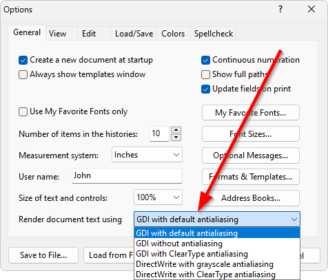
The text rendering options are now available on the "General" tab of the "Tools | Options..." dialog of this beta:
Re: Atlantis Word Processor 4.3.2 (beta)
Excellent! Thank you so much for the quick implementation of this option.
I just tried it out and it works perfectly. I think now every user can easily compare and find the rendering method which fits most for his taste, his eyes, his monitor or whatever may be the reason that the display of the characters is regarded as pleasant or not.
Just as information:
- Concerning myself, the best result is achieved with "GDI with default antialiasing" or "GDI with Cleartype antialiasing". (Until now I did not see any significant difference between these two methods.)
- "GDI without antialiasing" leads to a bad display.
- "DirectWrite with grayscale antialiasing" leads to the (for me unpleasant) look that I described above.
- "DirectWrite with ClearType antialiasing" seems to me a somehow "milder" version compared to the last one. - So I would choose it if I were forced to use "DirectWrite". But my favorite is GDI.
Thanks again for all your great work and support!
Re: Atlantis Word Processor 4.3.2 (beta)
If inconsistent spacing between characters (too big gaps or coalescing letters) is not a problem for you, GDI is a good choice indeed. GDI is also the only option on old systems running Windows 2000 and XP. Atlantis still supports these old versions of Windows.
In the a7 build, the DirectWrite display is much faster than before (10+ times on average). Also, now you do not need to click OK in the Options dialog to preview the rendering. As soon as you choose a new rendering method, Atlantis re-renders open documents using the newly selected rendering method.
Re: Atlantis Word Processor 4.3.2 (beta)
Atlantis Word Processor 4.3.2.0 beta a7
I’ve been experimenting with DirectWrite in beta a7 and find that it employs ligatures with some font families but not with others that have available ligatures, and when it does employ ligatures, the spacing immediately after them is often far too great. The words “The” and “efficient” in the Literata Text font family show this problem clearly, as do the words “after” and “find.” I’ve encountered similar but less pronounced problems with the Bookerly and Portada Text font families. DirectWrite also employs ligatures with the Noto Serif and Athelas font families, but it does a good job with spacing in those case. Also note that DirectWrite employs one or two different ligatures with some font families, but five or six with others, Literata Text being the most adversely affected. GDI doesn’t seem to employ ligatures at all so far as I can tell, which is certainly the safe way to go.
Literata Text is free from Google Fonts, so you might want to download it and test it yourself.
[I've attached an image of this text in Literata Text as it appears in Atlantis 4.3.2.0 beta a7 with DirectWrite/grayscale rendering.]
- Attachments
-
- Atlantis DirectWrite - ligatures.jpg (194.89 KiB) Viewed 19648 times
Re: Atlantis Word Processor 4.3.2 (beta)
Atlantis currently does not offer support for typographic features of OpenType fonts. Now Atlantis suppresses ligatures when rendering through DirectWrite. Thank you.
Re: Atlantis Word Processor 4.3.2 (beta)
I can confirm that ligatures are suppressed in beta a8. Thanks for the quick response.
Re: Atlantis Word Processor 4.3.2 (beta)
Sorry to be late coming back to the board. I have been very preoccupied for several days.
Just for the record, here is a screen shot (zoom = 120%) from a document that uses Noto Serif (regular, italic) and Noto Sans Condensed (bold). It looks pretty good to me. It is sharper in Atlantis than it is in the screenshot graphic here.
Re: Atlantis Word Processor 4.3.2 (beta)
I forgot to say that the screenshot was from Atlantis version 4.3.2.0 beta a8. Sorry about that. Windows 7 (yeah, I know it is old).
Re: Atlantis Word Processor 4.3.2 (beta)
Thanks. It is DirectWrite with grayscale antialiasing. Since it works on your Windows 7 system, you have the Platform Update for Windows 7 installed.