3.1 with toolbar customization
We are currently working on version 3.1 with customizable toolbars.
It should be available in a month or so.
-
- Posts: 52
- Joined: Tue May 31, 2016 10:08 am
3.1 with toolbar customization
How did you replicate the toolbars 2 to 3? That's what I want!
Many many thanks for your flexibility to make this possible .
Vincent van Gool, Amsterdam
Version 3.1 is available for betatesting.
The beta is much, much better, thank you!
I like the ability to customize the command rows (1 row, 2, etc.).
What irks me still is the inevitable fold-out of the menus. So even if you have all the icons you want in a section, once you click on any one icon, the menu still unfolds. Perhaps there could be an option to not unfold the menu sections; perhaps the sections could have a small, optional bar or icon that lets you unfold the sections (when wanted) with a click. Right now, when I quickly want to click the Justify align icon, the section always unfolds. This is very tricky for your eyes and navigation.
I would also like, when the bar is in Hide mode, to have a button/icon on the main program bar (file/edit/format, etc.) that allows the unfolding of the new UI. Either a button or a doubleclick of the menu bar.
A further improvement would be a dark skin for the new ui (even if only that; perhaps match it a bit with the old menu bar or a little darker, so it won't stand out too bad (if you don't want to go full dark). Then, paired with custom theme for the page area, it could be a lot more pleasant on the eyes. It would be great if you could make it customizable, like light-to-dark in several steps/stages, like you did for icon brightness.
I very much like the improvements so far. I would suggest to create an option for the inevitable new ui section foldouts, that really stands in the way of quick and efficient clicking.
You can change toolbar widths. There would be no fold-out if a toolbar is wide enough to accommodate the contained commands. You can have classic toolbars with no fold-out's/fly-out's, no category names, no context toolbars, and no advanced tooltips.patr wrote:What irks me still is the inevitable fold-out of the menus.
I see, I see. I had not realized the drag and drop and such, great!admin wrote:You can change toolbar widths. There would be no fold-out if a toolbar is wide enough to accommodate the contained commands. You can have classic toolbars with no fold-out's/fly-out's, no category names, no context toolbars, and no advanced tooltips.patr wrote:What irks me still is the inevitable fold-out of the menus.
OK, so I think that is going to work then. My remaining concerns would be settings some darker shades of grey for the new UI and perhaps show/hide button for new UI when that UI is in Hide mode (which is lower on my list now that the new UI can be customized to this extent).
Good work.
EDIT: Perhaps options for setting menu show delay on hover for new UI icons, slow/fast would be good.
Another thought about the dark options for new ui: if you allow a small range of, say, 4 or 5 shades of grey from light to dark, it would not burden you to have to come up with a "perfect" shade for a dark theme, in case there is some reduced visibility in relation to icons of certain colors. If dark won't work, set it to medium dark. More options for us, less burden on you
EDIT2: Regarding info pop up delay of the new UI icons, if speed option is not feasible, perhaps allow option to turn off the initial (short) version of the info popup, and only show to extended info when hovering over the icons longer. This way when you're an experienced user you don't continue to be thrown off by these icon popups as they would be superfluous when experienced.
EDIT3:
No more fold-outs
-
- Posts: 52
- Joined: Tue May 31, 2016 10:08 am
O wow I was afraid it might be a huge undertaking to try to replicate the version 2 system, and it does appear it will take a lot of work in dragging and dropping and comparing.
If possible it would surely be nice to have a "duplicate version 2 layout" option, since "Default" just takes you back to the new Version 3 layout. That would certainly save a lot of work for those of us who are trying to keep workflow interruptions to a minimum.
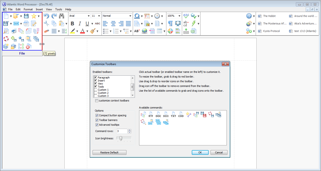
I think everyone will want to have to it slightly differently configured, but I did one quick layout (as shown above) and then captured the registry setting for it. So if I want this layout in the future I just double-click the .reg file I saved. Its contents for the layout shown above is:freecicero wrote:O wow I was afraid it might be a huge undertaking to try to replicate the version 2 system, and it does appear it will take a lot of work in dragging and dropping and comparing.
If possible it would surely be nice to have a "duplicate version 2 layout" option, since "Default" just takes you back to the new Version 3 layout. That would certainly save a lot of work for those of us who are trying to keep workflow interruptions to a minimum.
- Attachments
-
- patr.reg
- (3.58 KiB) Downloaded 659 times
The latest build of Atlantis Word Processor 3.1 (beta) allows to change background color for toolbars:
http://www.atlantiswordprocessor.com/en ... =9949#9949
It requires only a few minutes:freecicero wrote:O wow I was afraid it might be a huge undertaking to try to replicate the version 2 system, and it does appear it will take a lot of work in dragging and dropping and comparing.
https://www.youtube.com/watch?v=Xzcd23LqYFA
Very good, I could definitely work with the grey (the last, darkest) option. It is still quite light -- I think it's the same color as menu bar on top -- so I would suggest another shade darker, or two, as options. With the ability to set icon brightness, I think darker shades would still work quite nicely as we can set the icons to be quite contrasting -- even if the top menu bar could not be colored.admin wrote:The latest build of Atlantis Word Processor 3.1 (beta) allows to change background color for toolbars:
http://www.atlantiswordprocessor.com/en ... =9949#9949
With darkest option and maximum icon brightness:
EDIT: Ah, I can set custom shades/colors for the UI via HTML code in the registry. So, for me, that would suffice as I always customize Atlantis that way. So unless others would like to see darker options in the customization window, I would be happy with the ability to set color via the registry. One thing I would like to see is the respective colorization of the dropdown boxes (like Font, Font size, Zoom) because when those are folded out, they DO reflect the chosen ui color, but on the new UI bars (not unfolded) there is white around them. But this is minor and not that important. Like this:
-
- Posts: 52
- Joined: Tue May 31, 2016 10:08 am
3.1 program error in wine/crossover
Sorry I know this is minor but thought I would report it -
I use Atlantis in both windows and wine/crossover. Today for the first time ever, after I updated to 3.1, I got an "Exception: out of memory" error in wine. The message is quite delayed in coming up, and when it does I can click ok and the program seems to operate, but it seems off somehow.
When I go customize and tell it to use factory settings, it says Exception: Access violation at 0061B62D in awp.exe
I know that linux/wine is not your target market and I don't expect you to devote much time to addressing this, but I thought I would report it FWIW.
-
- Posts: 23
- Joined: Fri Sep 15, 2017 9:51 am
I really enjoy the new upgrade with the customizable toolbars!
For 3.1.1 I recommend adding the following options:
- Set the delay in milliseconds for showing the full panel (0 = instant)
- Show/hide panel name (File, Edit, View etc) in normal view, now the name of the tab only shows when the mouse hovers it but I might like otherwise.
- Ability to move and rearrange the order of the panels as you please. If I make a customized toolbar, I might prefer it to appear at the beginning of the panels or between two others, for example, say, between View and Tools.